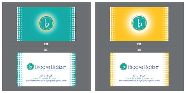
Here is a recent marketing set I designed for the SUPER talented Brooke Bakken. Brooke really wanted to incorporate some polka dots, but wanted to stay modern and classy, so we used the fading dots in a matrix type of environment, and kept it simple. She wanted a consistent look that she could mix and match in all of her promo items including flyers, cards, invoices and thank you cards. You can see more of the talented photographer at BrookeBakken.com. Check her out! You know you want to. Tell her kimi sent you. I don't know what that will get you... but tell her anyway.


No comments:
Post a Comment